Designing a rewards brand and card system for three venues from one concept
Summary
North Adelaide Football Club approached JABA to create a rewards membership program that could be used across their three hospitality venues, Pavilion at Prospect, Grand North, and Northern Tavern. The brief started as a simple membership card and evolved into a full brand identity, with the North Star name and visual concept developed entirely from scratch.
Role

Role
Brand Identity & Rewards Card Design
JABA Web Design Client
North Adelaide Football Club
Platform
Print & brand identity (Membership Card & Flyers)
Scope
Naming and concept development for the North Adelaide Football Club rewards program, front/back membership card design for 3 venues, visual identity system, groundwork for a future flyer/web rollout

Project Detail
The client came to us with a clear goal but an open brief. They wanted a venue membership that offered genuine value to locals who loved the venues but had no interest in a football club membership. Something simple enough for an older demographic to pick up at a bar, fill in, and keep in their wallet.
The first task was naming it. The client had floated "Roosters Venue Member" but was open to something better. North Star felt right immediately, it connected to the club's identity without leaning on football, worked across all three venues, and had the kind of name that could carry a brand long term.
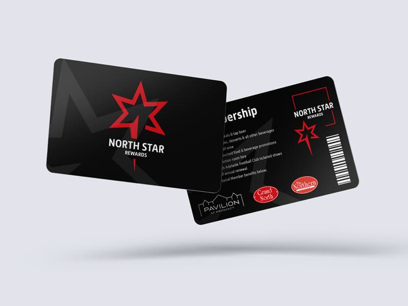
The visual design followed the name. A bold star mark in the club's red, set against a dark background with a subtle grey star pattern that gives depth without competing with the logo. The result is a card that feels premium and intentional, something worth keeping rather than discarding. The back of the card lays out the full membership benefits clearly alongside all three venue logos, reinforcing that this card works everywhere.
The brief also outlined a path beyond the card itself, including a DL flyer for counter display and landing pages across all four club and venue websites to promote the membership. The card design established the visual foundation for all of that.
The client's response said it best, the design embraced the red of the Roosters and stood out brilliantly, which was exactly the intention.