Designing a mobile car rental booking flow — a UX/UI case study
Summary
A UX/UI design project completed as part of a university design course, tasked with designing a car rental booking app from research through to a fully interactive high-fidelity prototype.
Research and usability testing were used throughout to identify why users hesitated during booking, and to redesign the flow around clarity and pricing transparency. The final prototype scored 9.5/10 on assessment.
Role
Role
Solo UX/UI Designer | Research, wireframing, high-fidelity prototyping
Client
Evolve Car Rental · UX Design Project
Platform
Mobile app, prototyped for Samsung S10+
Scope
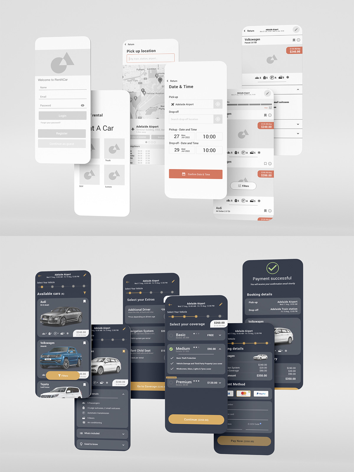
Customer journey mapping, full user flow design, high-fidelity UI across booking, payment and account screens, fully annotated interactive prototype
Project Detail
Evolve Car Rental app
Process
Research
The project began with two customer journey maps covering the full booking process, from initial acknowledgement of needing a car through to payment. Mapping goals, behaviour, context, and pain points at each stage surfaced a consistent thread: users weren't struggling with finding a car, they were struggling to trust what it would actually cost.
Pain points showed up early (unclear pickup/drop-off locations, cars not available during peak holiday periods) and resurfaced hard at the end, where "users are afraid of hidden costs afterwards" appeared directly in the payment stage feedback. That single insight, transparency, not simplicity, was the real problem, became the design brief for everything that followed.
Concepts and Wireframes
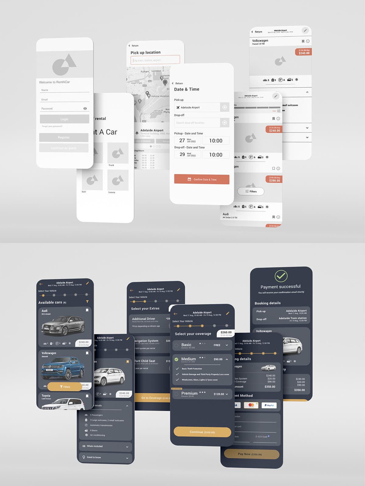
With the problem reframed around transparency, I moved into low-fidelity sketches to quickly test structure: how much information a user needed at each step (vehicle details, cover options, add-ons) without overwhelming a small mobile screen.
Sketches were built on paper first to keep iteration fast, then translated into digital wireframes to test navigation and layout before any visual design was applied.
Userflow
I mapped a complete userflow from app entry through to a confirmed booking, including every decision branch: selecting a vehicle type, correcting a location, creating an account versus logging in, and editing details before final payment. This flow became the backbone for the prototype build, making sure every "no" or "edit" path looped back to a sensible screen rather than a dead end.
UI Design
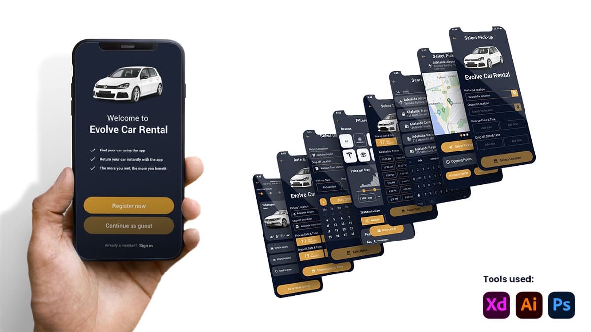
The visual identity used Roboto and Roboto Condensed for a clean, geometric feel, paired with a dark navy background (#091327) and a gold accent (#DF9C33) for primary actions, a palette intended to feel premium and trustworthy rather than budget or generic, reinforcing the transparency goal from the research phase rather than fighting against it.
High-Fidelity Prototype
The prototype was built out screen by screen in Adobe XD, starting with entry points (login, registration, guest checkout) through to vehicle selection, coverage, add-ons, and payment. The payment and coverage screens went through several fine-tuning passes, testing different layouts for card entry, payment method selection, and how clearly the running total was displayed, since that total was the exact anxiety point the research had flagged.
Every interactive element was annotated: what a tap does, what state it moves to next, and any rules a developer would need to know (for example, how the coverage selection expands to show inclusions before confirming, and how the submit button stays disabled until a coverage tier is chosen).
Feedback and Reflection
The submitted prototype scored 9.5/10. The assessor's main note was that hotspots weren't switched on for every interactive element, particularly the calendar, where the correct next step wasn't visually obvious without hovering to find it, and that a few interaction rules needed more explicit documentation, such as whether the calendar stays open after a pickup date is selected or closes automatically.
That feedback became a direct lesson in annotation completeness: it's not enough to explain what a screen does, every rule that isn't visually self-evident needs to be written down, since a developer reading it cold won't have the context I do. That standard is one I've carried into every case study since.