A small business WordPress rebuild case study
Summary
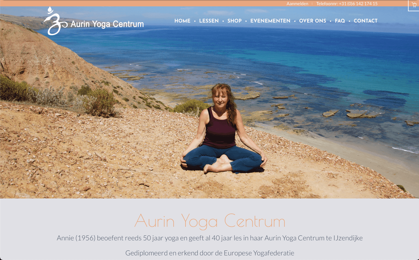
A full website rebuild and multi-year marketing partnership for Aurin Yoga Centrum, a yoga studio in IJzendijke run by teacher Annie Boekhout-Claeijs.
The scope covered a custom WordPress site with an integrated webshop, class scheduling, and booking forms, alongside a recurring run of printed flyers and posters that carried the studio's identity across several course years.
Role
Role
Web Design & Development, Photography, Print Marketing
Client
Aurin Yoga Centrum · A small business WordPress rebuild case study
Platform
WordPress, custom-built template
Scope
Website (webshop, scheduling, booking), photography (incl. drone), flyers & posters across multiple course years
Project Detail
Process
The website
The site is built on a custom WordPress template with seven core sections: Home, Lessen (Lessons), Evenementen (Events), Shop, Over Ons (About), FAQ, and Contact. Rather than a static timetable, the Lessen page runs on an interactive schedule grid, colour-coded by day and level, that updates each course year as times and levels change. A companion "Les niveau's" page breaks down each of the five levels, from Mild/Senioren through Krachtig-Dynamisch, with a short description and a simple visual breakdown of physical effort, relaxation, and pace, so a new student can find their level before ever setting foot in class.
The Shop section runs as a fully integrated webshop: yoga wear, essential oils, and studio-branded accessories, with the shop set up so customers can order online and pick up in person during class, matching how a small in-person studio actually operates rather than forcing a generic e-commerce flow onto it. The Over Ons page carries Annie's biography and teaching background alongside a photo gallery, and the FAQ page uses an accordion layout to keep practical, repeated questions (what to bring, arrival time, whether experience is needed) out of the way until a visitor wants them. Contact combines a location map with a direct enquiry form, and the same sign-up pattern (an "Aanmelden" call to action) is repeated across the pricing tiers on the Lessen page so registration is never more than one click from wherever a visitor is deciding.
Photography
The majority of the imagery on the site, including drone photography of the studio's surroundings, was shot and edited personally rather than sourced as stock. That extended into the printed materials as well: the recurring portrait sessions with Annie, shot in different settings across the years (on the beach, against a carved archway backdrop, in front of the Eiffel Tower for a group shoot), became the visual thread that carried the brand's identity forward even as the website and print layouts around them changed.
Print marketing
Alongside the website, flyers and posters were designed for the studio across multiple course years, each one carrying that year's programme, pricing, and class schedule while giving the identity room to evolve, from an early tri-fold flyer built around a palm-tree beach photograph, through later single-sheet posters built around a location-shoot portrait of Annie in a carved archway, to a group poster shot in front of a Eiffel Tower replica for a multi-teacher lineup. Each redesign kept the same core information architecture (programme, pricing, contact details, sign-up) while updating the photography and layout to keep the material feeling current rather than reprinted.